Product
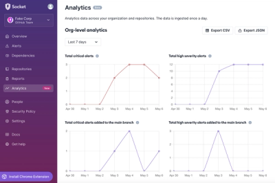
Introducing Dashboard Analytics
We're introducing a new Analytics feature in the Socket dashboard so you can view changes in your organization's and repositories' alerts over time.
By Charlie Gerard - Sep 05, 2024
@styled-system/css
Advanced tools
@styled-system/css is a utility function for creating style objects based on a theme. It allows you to use a JavaScript object to define styles, which can then be applied to components. This package is part of the Styled System family and is designed to work seamlessly with other Styled System utilities.
Theming
Theming allows you to define a set of design tokens (e.g., colors, spacing, typography) that can be referenced throughout your application. This ensures consistency and makes it easy to update the design system.
{
"theme": {
"colors": {
"primary": "#07c",
"secondary": "#05a"
}
},
"styles": {
"button": {
"backgroundColor": "primary",
"color": "white",
"padding": "8px 16px",
"borderRadius": "4px"
}
}
}Responsive Styles
Responsive styles allow you to define different styles for different screen sizes using an array syntax. This makes it easy to create responsive designs without writing media queries.
{
  "styles": {
    "button": {
      "padding": ["8px 16px", "12px 24px", "16px 32px"]
    }
  }
}
Variant Styles
Variant styles allow you to define reusable style objects that can be applied to components. This is useful for creating consistent styles for different variants of a component (e.g., primary and secondary buttons).
{
  "theme": {
    "buttons": {
      "primary": {
        "backgroundColor": "primary",
        "color": "white"
      },
      "secondary": {
        "backgroundColor": "secondary",
        "color": "white"
      }
    }
  },
  "styles": {
    "button": {
      "variant": "buttons.primary"
    }
  }
}styled-components is a library for styling React components using tagged template literals. It allows you to write actual CSS code to style your components. Compared to @styled-system/css, styled-components offers a more traditional approach to styling with CSS, but it lacks the built-in theming and responsive style utilities.
Emotion is a library designed for writing CSS styles with JavaScript. It provides both a CSS-in-JS solution and a styled-components-like API. Emotion offers similar theming and responsive style capabilities as @styled-system/css, but it also includes additional features like server-side rendering and source maps.
Tailwind CSS is a utility-first CSS framework that provides low-level utility classes to build custom designs. Unlike @styled-system/css, which uses JavaScript objects for styling, Tailwind CSS uses predefined utility classes in your HTML. Tailwind CSS is highly customizable and can be configured to work with a design system, but it requires a different approach to styling compared to CSS-in-JS solutions.
Styled System for the css prop
npm i @styled-system/css
Styled System CSS lets you write style objects with responsive, theme-aware Styled System shortcuts.
// usage with the css prop
import React from 'react'
import css from '@styled-system/css'

const Beep = props =>
  <div
    {...props}
    css={css({
      fontSize: [4, 5, 6],
      color: 'primary',
    })}
  />
// usage with a styled HOC
import styled from '@emotion/styled'
import css from '@styled-system/css'

const Boop = styled('div')(
  css({
    fontSize: [ 4, 5, 6 ],
    color: 'primary',
    bg: 'gray',
    '&:hover': {
      color: 'secondary',
    },
  })
)
To make the css prop work with styled-components, babel-plugin-styled-components must be enabled.
The following keys in your style object will work the same as Styled System props, pulling values from your theme object.
| Property | Theme Key |
|---|---|
fontFamily | fonts |
fontSize | fontSizes |
fontWeight | fontWeights |
lineHeight | lineHeights |
letterSpacing | letterSpacings |
color | colors |
backgroundColor, bg | colors |
margin, m | space |
marginTop, mt | space |
marginRight, mr | space |
marginBottom, mb | space |
marginLeft, ml | space |
marginX, mx | space |
marginY, my | space |
padding, p | space |
paddingTop, pt | space |
paddingRight, pr | space |
paddingBottom, pb | space |
paddingLeft, pl | space |
paddingX, px | space |
paddingY, py | space |
top | space |
bottom | space |
left | space |
right | space |
border | borders |
borderTop | borders |
borderRight | borders |
borderBottom | borders |
borderLeft | borders |
borderColor | colors |
borderWidth | borderWidths |
borderStyle | borderStyles |
borderRadius | radii |
boxShadow | shadows |
textShadow | shadows |
zIndex | zIndices |
width | sizes |
minWidth | sizes |
maxWidth | sizes |
height | sizes |
minHeight | sizes |
maxHeight | sizes |
size | sizes |
All CSS properties accept arrays as values for responsive styles.
<div
  css={css({
    fontSize: [ 4, 5, 6 ],
  })}
/>
In this example, fontSize accepts an array, picking up values from the theme.fontSizes scale, and borderBottom is passed through as plain CSS.
<div
  css={css({
    // Styled System key
    fontSize: [ 3, 4, 5 ],
    // CSS property
    borderBottom: '2px solid tomato',
  })}
/>
MIT License
FAQs
Styled System for the `css` prop
The npm package @styled-system/css receives a total of 419,236 weekly downloads. As such, @styled-system/css popularity was classified as popular.
We found that @styled-system/css demonstrated a not healthy version release cadence and project activity because the last version was released a year ago. It has 1 open source maintainer collaborating on the project.
Did you know?

Socket for GitHub automatically highlights issues in each pull request and monitors the health of all your open source dependencies. Discover the contents of your packages and block harmful activity before you install or update your dependencies.
Product
We're introducing a new Analytics feature in the Socket dashboard so you can view changes in your organization's and repositories' alerts over time.
Security News
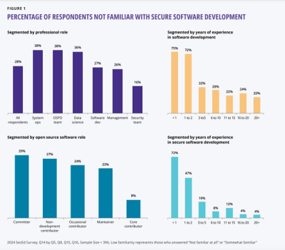
A new OpenSSF report uncovers critical gaps in secure software training, with 75% of new developers unfamiliar with secure practices, highlighting urgent educational needs.

Security News
The 2023 Python Developers Survey reveals key trends in packaging, web frameworks, and developer demographics, highlighting a shift toward innovative tools as the Python community diversifies and grows among less experienced developers.